


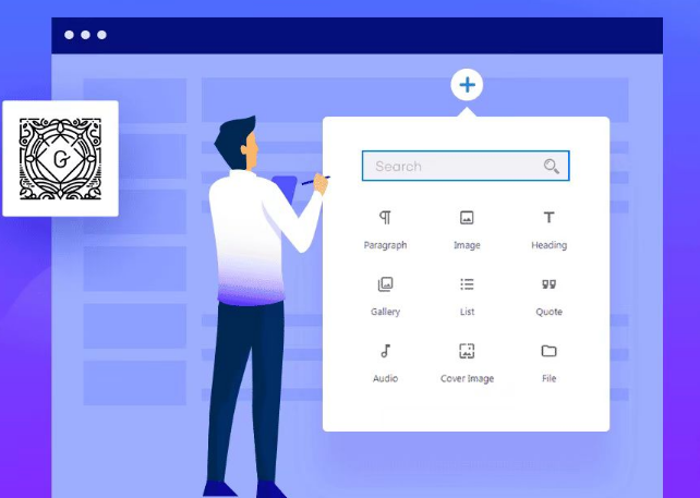
Elementor is a very powerful page builder that allows designers to create beautiful, functional web pages without programming knowledge. In addition to its intuitive drag-and-drop interface, Elementor offers several advanced design tools such as CSS Transform Controls. With these controls, it is possible toAdd transformations such as rotation, offset, scaling, skewing, and flipping to page elements, creating a distinctive visual effect.
![图片[1]-如何使用 Elementor CSS Transform 控件添加特殊效果-光子波动网 | 专业WordPress修复服务,全球范围,快速响应](https://www.361sale.com/wp-content/uploads/2024/09/2024090606513032.png)
In this post, we'll dive into how to utilize the CSS Transform controls to add special effects to your designs, with detailed instructions on how to use each effect and practical application scenarios.
What are CSS Transform controls?
The CSS Transform control allows you to create a new CSS Transform control by using theRotate, Scale, Offset, Skew and Flipetc.Transforming widgets on the pageThese controls are available in Elementor's These controls are available in Elementor's "Advanced tab"Under."a transformation" found in the settings, supports both normal and hover states. When editing the hover state, you can alsoSetting the duration of the effect, to ensure that the effect is smooth and not jittery.
![图片[2]-如何使用 Elementor CSS Transform 控件添加特殊效果-光子波动网 | 专业WordPress修复服务,全球范围,快速响应](https://www.361sale.com/wp-content/uploads/2024/09/2024090606550875.png)
Description of controls
Each transform effect can be set to different values for different screen breakpoints. The Responsive Settings screen can be accessed by clicking on the device icon on the control's tab for optimal results on different devices.
Rotate
revolvecontrol allows rotating page elements around a specific axis. The rotation is achieved by sliders or by directly filling in the input box with the angle value (in the form of areading (on a meter)(in units), you can easily adjust the rotation effect.
- Ordinary rotation: Rotates the element along the Z-axis (two-dimensional plane).
![图片[3]-如何使用 Elementor CSS Transform 控件添加特殊效果-光子波动网 | 专业WordPress修复服务,全球范围,快速响应](https://www.361sale.com/wp-content/uploads/2024/09/2024090607015330.png)
- 3D rotation: If you need more complex visual effects, you can enable 3D rotation, which allows the X, Y and Z 3D rotation can also be combined with perspective effects (in pixels) to enhance three-dimensionality.
![图片[4]-如何使用 Elementor CSS Transform 控件添加特殊效果-光子波动网 | 专业WordPress修复服务,全球范围,快速响应](https://www.361sale.com/wp-content/uploads/2024/09/2024090607035168.png)
Practical applications: For example, you can add an icon to a button with a 3D Rotation Effect, the buttons rotate slightly when the user hovers to liven up the design.
Scale
![图片[5]-如何使用 Elementor CSS Transform 控件添加特殊效果-光子波动网 | 专业WordPress修复服务,全球范围,快速响应](https://www.361sale.com/wp-content/uploads/2024/09/2024090607064831.png)
The Zoom control allows you to scale page elements. They can be scaled proportionally (Simultaneous scaling of the X and Y axes), or you can adjust the scaling of an axis individually. Elements can be resized via sliders or by typing a percentage directly into the input box.
- Equal scaling: By default, the X and Y axes are scaled at the same time, keeping the original scale of the element.
- Individual scaling: If you want to scale in one direction, you can unlock the scale to adjust the individual X or Y axes.
Practical applications: For example, it is possible to have certain buttons or images zoom in slightly when the user hovers over them to draw attention to them.
Skew
![图片[6]-如何使用 Elementor CSS Transform 控件添加特殊效果-光子波动网 | 专业WordPress修复服务,全球范围,快速响应](https://www.361sale.com/wp-content/uploads/2024/09/2024090607074591.png)
leanThe control allows to add a tilt effect to the element on the X and Y axes. The tilt angle can be easily adjusted by using the slider or by entering a percentage value in the input box.
- X-axis tilt: horizontalDirection Tilt.
- Y-axis tilt: perpendicularDirection Tilt.
Practical applications: The tilt effect can add a sense of dynamism to an image or block of text, and is especially useful for creating modern, unique designs.
Horizontal Flip and Vertical Flip (Flip)
![图片[7]-如何使用 Elementor CSS Transform 控件添加特殊效果-光子波动网 | 专业WordPress修复服务,全球范围,快速响应](https://www.361sale.com/wp-content/uploads/2024/09/2024090607081835.png)
- Flip horizontally: Place an element on the X-axis of themirroringFlip.
- Vertical flip: Place the element on the Y-axismirroringFlip.
Practical applications: Flip effects can be applied to images, icons, or other visual elements to enhance the interactive experience by allowing the user to see the other side of the element when hovering.
Anchor Point
![图片[8]-如何使用 Elementor CSS Transform 控件添加特殊效果-光子波动网 | 专业WordPress修复服务,全球范围,快速响应](https://www.361sale.com/wp-content/uploads/2024/09/2024090607111883.png)
The Anchor Point control allows you to set the starting point of the transformation, which is the center point of the element when it is rotated, scaled, or skewed. Optional:
- Horizontal anchors: Left, center and right.
- Vertical anchors: Top, Center, Bottom.
By adjusting the anchor point, you can control the transformation effect more precisely. For example, if you set the anchor point to the upper left corner of an element, the element will rotate around the upper left corner when rotated, theNot the center.The
Practical applications: For example, anchor positions can be adjusted to create more complex visual effects when asymmetric rotation or tilt effects are desired.
How to set CSS Transform for hover state
In Elementor, it is not only possible to set theCSS transformations for setting the regular state of a page elementYou can also set different effects for the hover state (i.e. when the user hovers the mouse pointer over the element). To edit the transformation of the hover state, you can:
- Select the element and go to "Advanced tab".
- Make adjustments in the Transform settings and choose effects such as Rotate, Offset, Scale, Skew or Flip.
![图片[9]-如何使用 Elementor CSS Transform 控件添加特殊效果-光子波动网 | 专业WordPress修复服务,全球范围,快速响应](https://www.361sale.com/wp-content/uploads/2024/09/2024090607173698.png)
- Settings"Effect duration" to smooth the transformation process.
Practical applications: In website design, hover effects can effectively enhance the user experience. For example, rotation and zoom effects can be triggered when the user hovers the mouse over a button, making the button appear more interesting and interactive.
Practical example: how to use CSS Transform to realize 3D button effect.
Here is a simple tutorial to create a 3D button effect using the CSS Transform control:
- Add button widgets: In the Elementor page editor, add a button widget.
- Enter the transformation settings: After selecting the button, go to "Advanced tab">"a transformation".
![图片[10]-如何使用 Elementor CSS Transform 控件添加特殊效果-光子波动网 | 专业WordPress修复服务,全球范围,快速响应](https://www.361sale.com/wp-content/uploads/2024/09/2024090607190656.png)
- Apply rotation and perspective effects:
- In Rotation Settings, enable 3D Rotation.
- Set the rotation values for the X-axis and Y-axis. It is recommended to keep the rotation angle within 10 degrees to ensure naturalness.
- Combine this with a perspective effect, e.g. set the perspective value to 800px to enhance the 3D effect.
![图片[11]-如何使用 Elementor CSS Transform 控件添加特殊效果-光子波动网 | 专业WordPress修复服务,全球范围,快速响应](https://www.361sale.com/wp-content/uploads/2024/09/2024090607194996.png)
- Set the hover effect: On hover, adjust the rotation angle to 0 degrees and add a zoom effect by setting the zoom value to 1.1 to make the button zoom in on hover.
With this simple transformation setup, you can easily create an interactive button with a 3D effect to enhance the user's visual experience.
summarize
CSS Transform is an important part of Elementor's powerful design features, allowing designers to add rich, dynamic effects to their pages with a few simple actions. Whether it's rotating, scaling, tilting, or flipping, all of the controls can be flexibly combined to add dimension and interest to your designs.
Link to this article:https://www.361sale.com/en/19029The article is copyrighted and must be reproduced with attribution.


![表情[xiaojiujie]-光子波动网 | 专业WordPress修复服务,全球范围,快速响应](https://www.361sale.com/wp-content/themes/zibll/img/smilies/xiaojiujie.gif)


No comments