


粘性侧边栏菜单不仅为网站带来了现代化的设计感,还能为访问者提供更身临其境的滚动体验。在本文中,我们将深入探讨如何在WordPress上使用 Elementor respond in singing Elementor Pro 创建一个功能强大的粘性侧边栏菜单。
什么是粘性侧边栏菜单?
![图片[1]-如何在WordPress上创建粘性侧边栏菜单:详细教程-光子波动网 | 专业WordPress修复服务,全球范围,快速响应](https://www.361sale.com/wp-content/uploads/2024/08/2024081504231472.png)
粘性侧边栏菜单与传统的水平导航菜单不同,它们占据了网站左侧或右侧的垂直空间。这种菜单始终存在于页面中,即使用户向下滚动页面,菜单也会固定在侧边位置,从而提供连续的导航选项。
通常,粘性侧边栏菜单默认是最小化状态,仅占用少量空间。用户可以点击一个图标来展开菜单,以显示更多的导航链接。这种设计特别适合桌面和平板电脑用户,但对于移动设备而言,传统的水平菜单可能仍然是更好的选择。
粘性侧边栏菜单的优势
- 节省垂直空间:粘性侧边栏菜单将导航元素垂直放置,释放了顶部的垂直空间,使得网站内容可以充分利用屏幕的高度。
- Enhanced user experience:这种菜单设计提供了一个独特且现代的滚动体验,用户可以更容易地访问导航选项,而无需回到页面顶部。
- 更好地组织内容:通过垂直布局,网站的不同部分可以更加清晰有序地展示,尤其适合内容丰富的网站。
使用Elementor创建粘性侧边栏菜单所需工具
在开始创建粘性侧边栏菜单之前,你需要准备以下工具和功能:
- Elementor:这是一款流行的WordPress页面构建器,提供了丰富的设计和布局选项。
- Elementor Pro:要实现粘性侧边栏菜单,你需要使用Elementor Pro中的一些高级功能,如弹出窗口和主题模板。
- 常规标题模板:这是为移动设备访问者设计的标题模板,确保在移动端提供良好的导航体验。
- 部分模板:用于创建最小化状态的侧边栏菜单,作为粘性侧边栏的基础。
- pop-up window:用于显示完整的导航菜单,当用户点击最小化侧边栏图标时触发弹出。
创建粘性侧边栏菜单的步骤
1. 隐藏桌面和平板电脑视图中的常规标题
首先,你需要确保现有的标题模板仅在移动设备上显示,而不在桌面和平板电脑上显示。为此,请按照以下步骤操作:
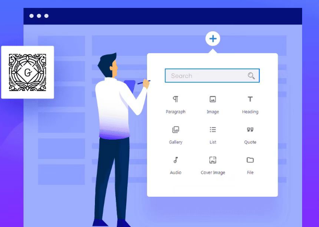
- 进入Elementor的主题构建器(模板 → 主题构建器 → 标题),选择你的标题模板并使用Elementor编辑。
![图片[2]-如何在WordPress上创建粘性侧边栏菜单:详细教程-光子波动网 | 专业WordPress修复服务,全球范围,快速响应](https://www.361sale.com/wp-content/uploads/2024/08/2024081504235238.png)
- 在Elementor编辑器中,选择标题部分并转到“high level"Tab.
- 在“响应”设置中启用“在桌面上隐藏”和“在平板电脑上隐藏”。
![图片[3]-如何在WordPress上创建粘性侧边栏菜单:详细教程-光子波动网 | 专业WordPress修复服务,全球范围,快速响应](https://www.361sale.com/wp-content/uploads/2024/08/2024081504244265.png)
这样做可以确保桌面和平板电脑用户仅看到侧边栏菜单,而不会看到常规的水平标题。
2. 创建侧边栏导航的部分模板
接下来,我们将创建一个新模板,用于定义侧边栏菜单的最小化状态。这将是用户初次加载页面时看到的内容。
- 进入WordPress后台的模板区域,选择“部分”选项卡并点击“添加新”。
- 创建一个包含一列的新部分,并按以下方式配置设置:
- 内容宽度:全宽
- 柱间隙:无间隙
- 高度 → 最小高度:100vh(使侧边栏占据整个垂直高度)
- 柱位置:拉伸
- HTML 标签:标题(可选,但对SEO有帮助)
在“样式”选项卡中,你可以配置侧边栏的背景颜色或渐变,以与网站其他部分保持一致。
3. 配置列设置和添加小部件
在部分模板中添加一些基本的小部件,如网站徽标、导航图标(用于展开完整菜单)以及社交媒体图标。
![图片[4]-如何在WordPress上创建粘性侧边栏菜单:详细教程-光子波动网 | 专业WordPress修复服务,全球范围,快速响应](https://www.361sale.com/wp-content/uploads/2024/08/2024081504275585.png)
- 使用图像小部件添加徽标。
- 使用图标小部件添加一个用于触发弹出导航菜单的图标。你可以选择任何合适的图标,如Bars图标,并配置其颜色和悬停效果。
- 使用社交图标小部件添加社交媒体链接,并确保它们垂直排列。
完成配置后,发布或更新部分模板。
4. 创建包含侧边栏导航的新单页模板
接下来,需要使用 Elementor 主题构建器创建一个新的单页模板,其中包含您网站的内容和粘性侧边导航标题。
To do so, please go to模板→主题构建器:
- switch to“单页” tabs
- click (using a mouse or other pointing device)"Add new"
- 确保 选择single page 作为模板类型
- 将其命名为固定侧边导航的页面

在 Elementor 编辑器中,创建一个包含两列的部分:
- 左栏– 这将容纳粘性侧边栏
- 右栏– 这将包含您网站的常规内容
配置右栏(内容)
要将常规内容添加到右栏,请添加 “帖子内容”Widget.

配置左栏(侧边栏标题)
要将侧边栏导航标题添加到左侧菜单,请添加模板小部件。然后,选择您在上一步中创建的粘性侧边栏标题模板。
此外,转到此列的高级设置,将Z-index值设置为10000 (一万),并将responsive控件设置为启用“在移动设备上隐藏”。这可确保只有桌面和平板电脑访问者才能看到您的粘性侧边导航标题。

配置列间距/布局
侧边栏占据了页面的 50%。要解决这个问题,请选择左侧列(带有侧边栏),并在“布局”选项卡中将其column widthset to5%。这会自动使右侧列等于95%The
设置 z-index 值可确保你在下一步中创建的完整导航弹出窗口在侧面导航下方滑动。
selector {
    width: 60px;
}
复制此 CSS 通过将宽度设置为 60 像素来确保侧边导航始终保持较窄。可以根据自己的喜好随意调整此数字,但不要偏离 60px 太多。

配置运动效果
现在我们要确保侧面导航始终固定在屏幕上。
为此,请单击右栏上的模板:
- switch to"Advanced" Tab.
- click (using a mouse or other pointing device)“运动效果”The
- 将“置顶”设置 为“置顶”The
- commander-in-chief (military) “粘性”set to“桌面”respond in singing“平板电脑”The

现在,发布你的单页模板并使用Display conditions来控制其显示位置。如果你想在每个页面上使用粘性侧边导航,请将其设置为显示在All Pages上。
如果将其添加到已有一些现有页面模板的网站,请确保将所有现有模板更改为“草稿”状态以禁用它们并避免潜在的冲突。
5. 配置弹出导航菜单
为了让用户能够展开完整的导航菜单,我们需要创建一个弹出窗口。这个弹出窗口将在用户点击侧边栏的图标时显示。
- 进入模板→弹出窗口,点击“添加新”并创建一个新的弹出窗口。
- 配置弹出窗口的设置,如宽度、入口动画、退出动画等,并添加适当的边距。
- 在弹出窗口中添加导航菜单小部件,确保菜单项垂直排列。
发布弹出窗口后,返回到侧边栏模板,配置图标的动态标签为“pop-up window”,并选择刚刚创建的弹出菜单。
![图片[10]-如何在WordPress上创建粘性侧边栏菜单:详细教程-光子波动网 | 专业WordPress修复服务,全球范围,快速响应](https://www.361sale.com/wp-content/uploads/2024/08/2024081504521428.png)
6. 测试并优化
至此,你的粘性侧边栏菜单已经基本完成。打开网站页面,测试侧边栏菜单的功能和外观,确保它按预期工作。
如果在测试中遇到任何问题,建议尝试使用Elementor的Hello主题,以确保与其他主题没有冲突。
summarize
粘性侧边栏菜单为WordPress网站带来了全新的设计和导航体验。通过利用Elementor和Elementor Pro的强大功能,你可以轻松创建一个灵活且美观的垂直导航菜单,为访客提供更好的浏览体验。
Link to this article:https://www.361sale.com/en/16894
The article is copyrighted and must be reproduced with attribution.


 简体中文
简体中文  English
  日本語
日本語  Français
  Español


No comments